ANONymous help
Would you donate without knowing the full backstory?
Anonymous Help is a digital platform that connects individuals seeking support with those willing to assist them, all while maintaining anonymity. Unlike traditional fundraising platforms, Anon Help places a strong emphasis on anonymity, fairness, and dignity. Users have the option to request help, donate their assistance, browse through various needs, and engage in interactions without disclosing their personal identity unless they choose to do so.
Case Study
Bentley University Individual Project
Timeline
Fall 2025
Role
Concept Creator, UX Researcher & Designer
Tools Used
Figma, Miro, Sora
Project purpose
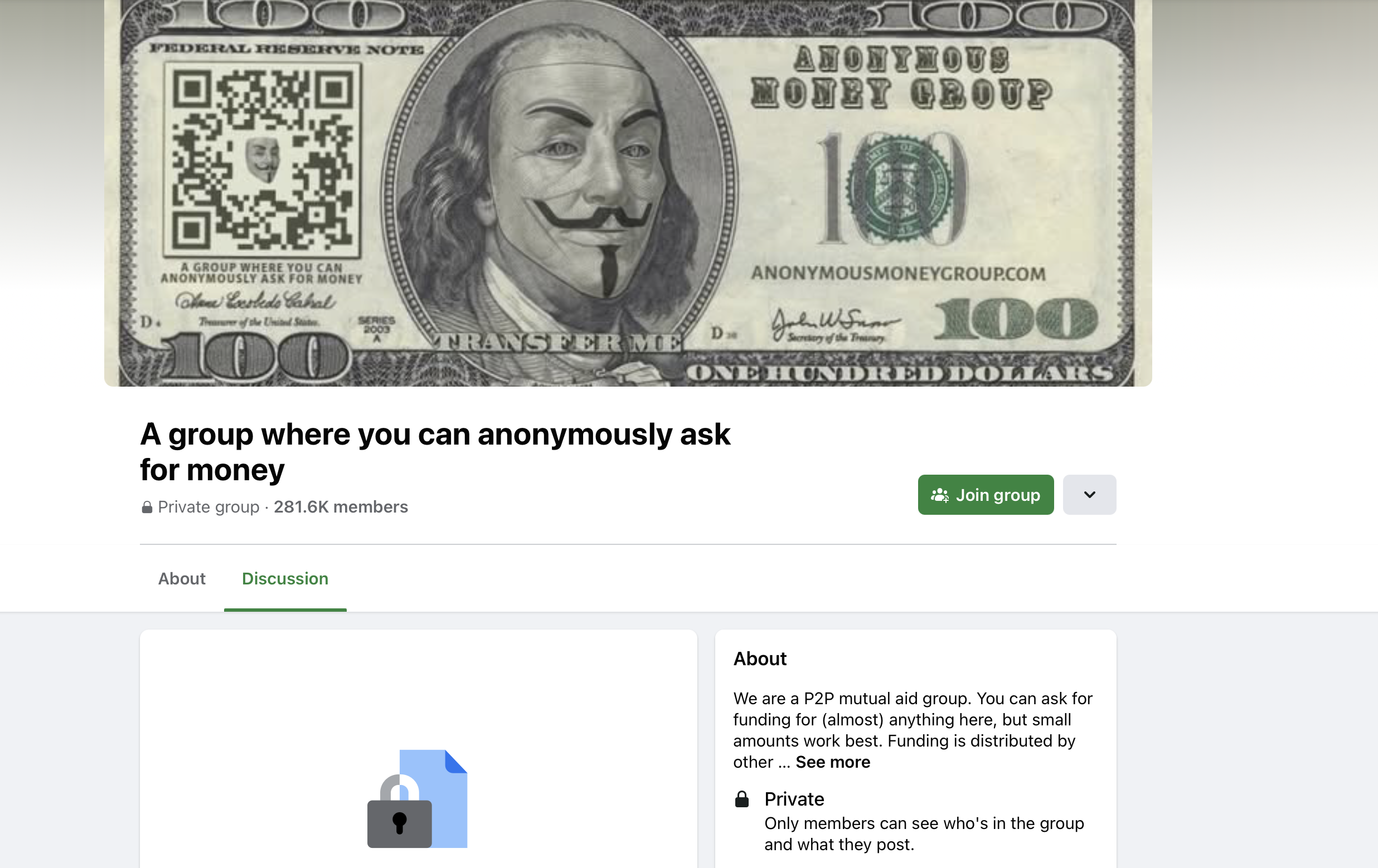
During a period of unemployment in 2025, I joined a Facebook community intriguingly named “A group where you can anonymously ask for money.” What initially felt like a silly curiosity soon turned into a powerful source of empathy. I witnessed countless heartfelt pleas: parents with only a few dollars left for dinner, a survivor needing gas money to escape a dangerous situation, a family desperately trying to keep the lights on. Each post was made under the safety of anonymity, and the group had over 281,000 members helping each other.
This digital platform concept connects individuals seeking urgent support with those willing to assist, all while preserving everyone’s privacy and dignity. Unlike traditional crowdfunding where personal profiles and promotions are the norm, Anonymous Help emphasizes quick relief, fairness, and anonymity. Users can request a small amount of help or give to others in need, without ever disclosing their identities unless they choose to.
This project was completed as an individual UX design case study for a Prototyping & Interaction Design course at Bentley University (Fall 2025, Sept–Dec). In this case study, I’ll walk through my end-to-end process: from initial user understanding and problem definition, to ideation, prototyping, visual design, testing, and final reflections.
lean ux canvas
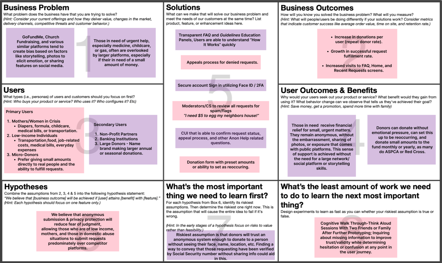
I employed a Lean UX Canvas exercise (as guided by our course instructor). This helped me map out the problem statement, target users, hypotheses, and what I needed to learn early on, before jumping into design solutions.
Problem Statement: People facing short-term financial emergencies often avoid seeking help on existing platforms due to fear of judgment and lack of anonymity. How might we enable them to get timely support without sacrificing their privacy or dignity?
In the Lean UX Canvas, I identified key elements:
Users: Individuals like Marco who have an urgent financial need but are uncomfortable with public aid requests; and empathetic donors who are open to giving, as long as they trust the platform.
User Needs: A safe, non-judgmental way to request small-scale help. For donors, a simple way to help real people without needing personal details.
Business/Success Outcomes: A thriving peer-to-peer support community where more people ask for and receive help quickly. Success could be measured by metrics like number of requests fulfilled, average time to fulfillment, and repeat participation (which would indicate trust in the system).
Assumptions: I assumed that anonymity will lower the barrier for people in need to actually ask for help. I also assumed that donors will still contribute based on an anonymous story if it feels genuine and urgent. These were riskiest assumptions that needed validation.
Hypotheses: “If we provide a platform that guarantees anonymity, then more users in need will seek help because they feel safe from judgment.” Conversely, “If we show brief but compelling stories of need, then altruistic donors will step up even without knowing the recipient’s identity.” I also hypothesized that incorporating some basic verification or community monitoring would be necessary to foster trust on the platform.
What I needed to learn: Would users actually trust this app enough to use it? Are donors comfortable giving money with so little information? What’s the smallest amount of information or effort required to make a donor feel confident their money will truly help someone? These questions guided my research and design focus.
Defining these elements early was immensely helpful. It kept me focused on solving the right problem: creating a space for anonymous, genuine help. It also highlighted the delicate balance I’d need to strike between privacy and credibility. With a clear problem definition in mind, I set out to generate and explore potential solutions.
Who Is Our Ideal User?
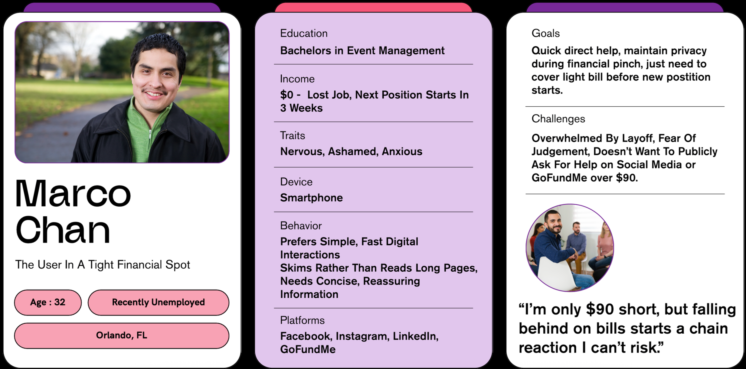
My first step was immersing myself in the experiences of both people asking for help and those who might give it. The Facebook group origin provided a raw, unfiltered window into the users’ world. I read through dozens of anonymous posts and comments, using empathy mapping to capture what people say, think, do, and feel in these vulnerable situations. Many recurring themes emerged: people in need often felt embarrassed and anxious, yet also hopeful. They would say things like “I never thought I’d be here asking strangers for help,” revealing a fear of judgment. At the same time, generous group members expressed compassion but also occasional skepticism, wondering if every story was genuine.
To humanize these insights, I crafted a primary persona: Marco Chan. Marco is a 29 year old who recently lost his job but has a new one lined up in a month. He’s hit a short-term financial pinch and needs just a bit of help to bridge the gap, but he’s uncomfortable asking friends or family. He values his privacy and pride. As Marco put it in our scenario, “I’m only $90 short, but falling behind on bills starts a chain reaction I can’t risk.” This quote encapsulates the urgency and stakes for someone in his position.
Concept Creation
With the problem well-framed, I began brainstorming solutions and features that could bridge the gap between anonymous help-seekers and cautious but willing donors. I embraced a “no bad ideas” mindset and sketched out various concepts in my notebook. Some of the early ideas included: an anonymous posting feed (similar to the Facebook group, but standalone), a one-click donation system for convenience, a way to verify urgent needs through community upvotes or a moderator, and even the option for successful recipients to later reveal their identity or story as a form of proof and gratitude (only if they wanted to). I considered how to keep the experience simple, since many users like Marco might be in stressful situations, so any solution needed to be quick and intuitive.
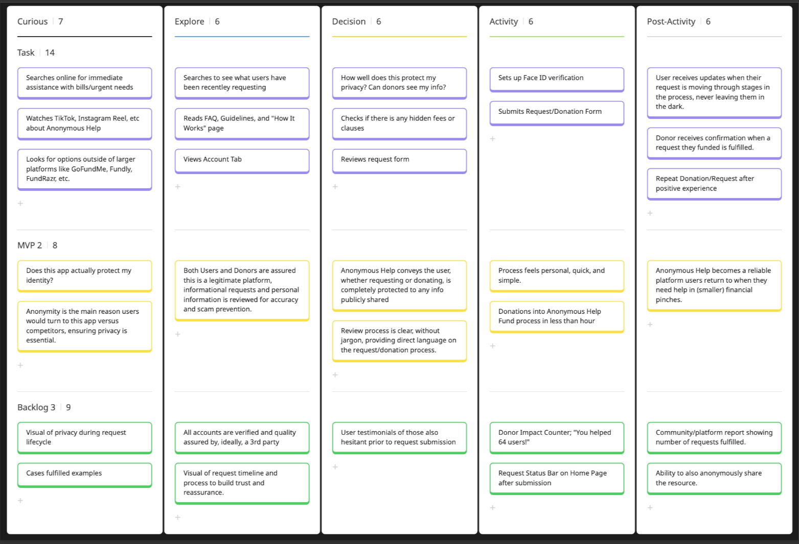
A key method I used during ideation was storyboarding. To ensure the solution would feel seamless in context, I sketched a storyboard of Marco’s journey using Anonymous Help. This exercise allowed me to visualize the user flow and emotional states at each step:
Problem arises. Marco is staring at his overdue electric bill, feeling anxious because payday is weeks away. He remembers there might be a way to get help anonymously.
Finding the platform. Marco opens the Anonymous Help app on his phone. He’s nervous but the app’s welcome screen reassures him: “Ask for help anonymously, only share what you’re comfortable with.”
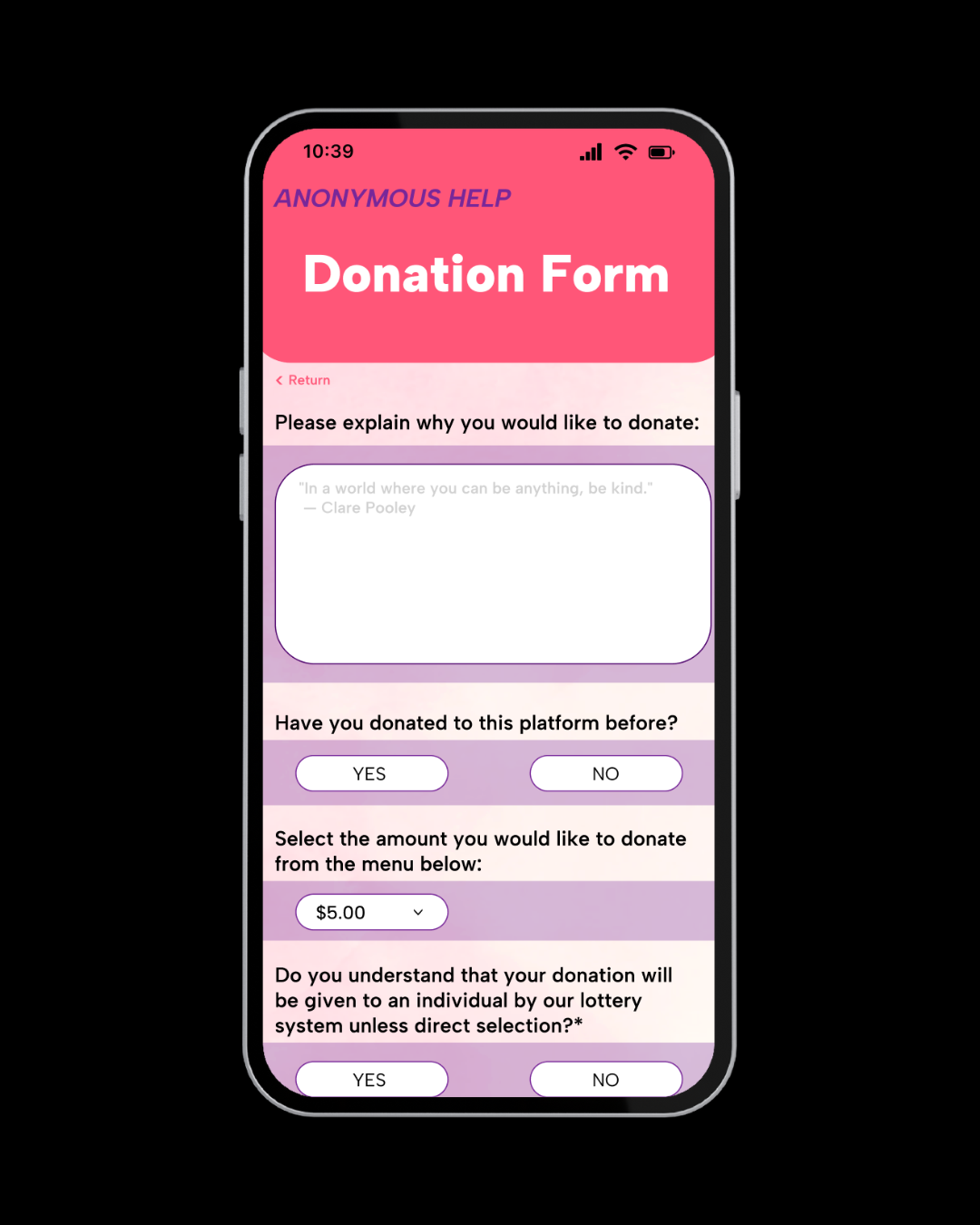
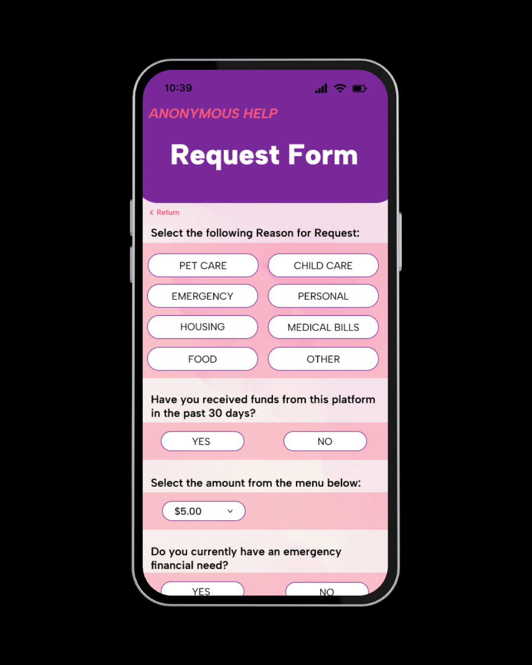
Posting a request. Marco fills out a short request form: he enters
$90as the amount needed and writes a brief description of why (without revealing personal details). A prompt reminds him his name will not be shown to others. He hesitates, then hits “Post Request.”Donor’s perspective. Elsewhere, Jane, a community member browsing the app, sees a new request pop up: “Need $90 to keep the lights on this month.” She can read Marco’s short story but only sees him labeled as “Anonymous User #1357.” Moved by his situation, Jane decides to help. She taps “Donate” and seamlessly sends $30 via the app’s built-in payment system. Others donate in small increments too.
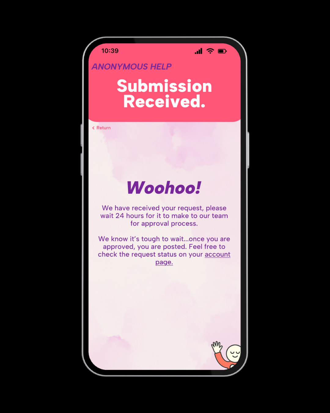
Resolution. A notification pings on Marco’s phone: “Your request has been 100% funded!” Relieved and grateful, he anonymously writes a thank-you message that gets sent to his supporters. He’s able to pay his bill and keep his situation private. Meanwhile, Jane feels good knowing she helped someone, even if she never learns his name, the impact was clear.
Marco’s initial shame and relief, the donor’s need for confidence in the story, and the joy on both sides when help is given. It confirmed that the core value of the product would be enabling those moments of trust and relief without exposing identity. It also brought up design considerations, for example, how to reassure users like Marco at the posting step, and how to show donors that their money truly goes toward a real person’s need.
Throughout ideation, I also thought about scope and feasibility. As a solo student project, I focused on the most critical user flow (request and donation) rather than tangential features. For instance, I considered and set aside the idea of corporate donations or a complex vetting system, noting those as future enhancements. By the end of the ideation phase, I had a clear vision of the solution: a mobile app with a feed of anonymous help requests, a simple request form, and an easy way for people to contribute, wrapped in a UI that builds trust through transparency about the process (not personal details).
Lo-Fi Prototyping & Testing
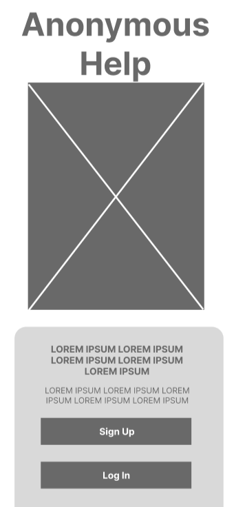
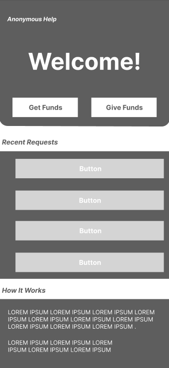
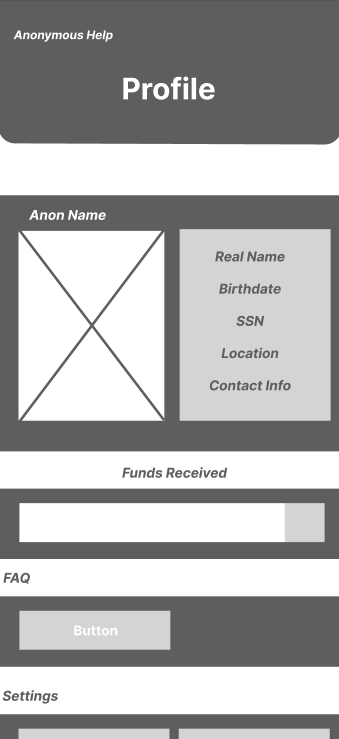
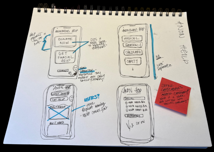
After some iteration, I created a clickable wireframe prototype using simple shapes and grayscale in Figma to simulate the experience and test the flow and usability before polishing the visuals. Brainstorming some key screens after the paper drafts: the sign in screen, the home feed of requests, the “need funds”/request screen, and the profile where you can keep track of your request process. Sketching allowed quick iteration, I sketched multiple layouts for how a request might be displayed (e.g. as a card with an amount and story snippet) and how the donation process might work (perhaps a popup vs. a separate screen).
With this lo-fi prototype, I conducted user testing with 5 people. These were a mix of family and friends acting as proxies for our target users (both potential requesters and donors). I gave them a scenario and a couple of tasks. For example, one task was: “Imagine you are in a tough spot and need $100 for an emergency. How would you use this app to get help?” Another task flipped the perspective: “Now imagine you have some extra money and want to help someone. How would you find a request and donate?” I observed their interactions and asked them to think aloud.
Key findings from lo-fi testing:
Overall Concept Clarity: All testers immediately understood the app’s purpose, which was a positive sign. They navigated to the “get funds” button easily and grasped that the feed items were anonymous help calls. This validated that the basic flow made sense.
Anonymity Reassurance: A couple of participants paused at the request form, asking, “Will anyone know this is me?” This highlighted that I needed to make anonymity absolutely clear. In response, I decided to add a small note or icon on the form saying “Your identity will remain hidden” as reassurance.
Trust and Safety Concerns: On the donor side, testers wondered how they could trust that requests were legitimate. One person said, “I’d like to know if this platform verifies any of these requests.” While full verification was outside the scope of the prototype, this feedback underscored the importance of building trust through design. I noted to possibly include a badge or brief statement like “Community-vouched” on requests that had positive feedback, or an upfront note about how the platform monitors fraud.
Usability Issues: There were a few small usability snags. For instance, initially my donation flow had the donor manually typing an amount each time. Testers found that tedious, so I decided to include quick buttons for common amounts (e.g. $10, $20) to streamline it. Another minor issue was that the “Help Out” (donate) button on a request card wasn’t prominent enough in my wireframe; a tester missed it at first glance. I marked this to be visually emphasized (perhaps as a bright button) in the high-fidelity design.
After gathering these insights, I iterated on the low-fi design. I updated the wireframes to address the feedback: adding the anonymity info text, tweaking labels (changing a generic “Submit” to a friendlier “Post Request”), and simplifying the donation sequence. These adjustments were relatively quick thanks to the low-fi nature of the prototype. By the end of this cycle, I felt confident that the core user journey was solid and that I had a plan to tackle the trust and clarity issues.
High-fidelty design
FINISHED PRODUCT
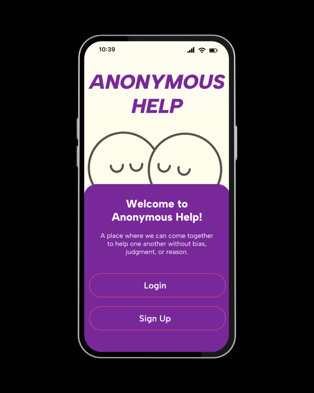
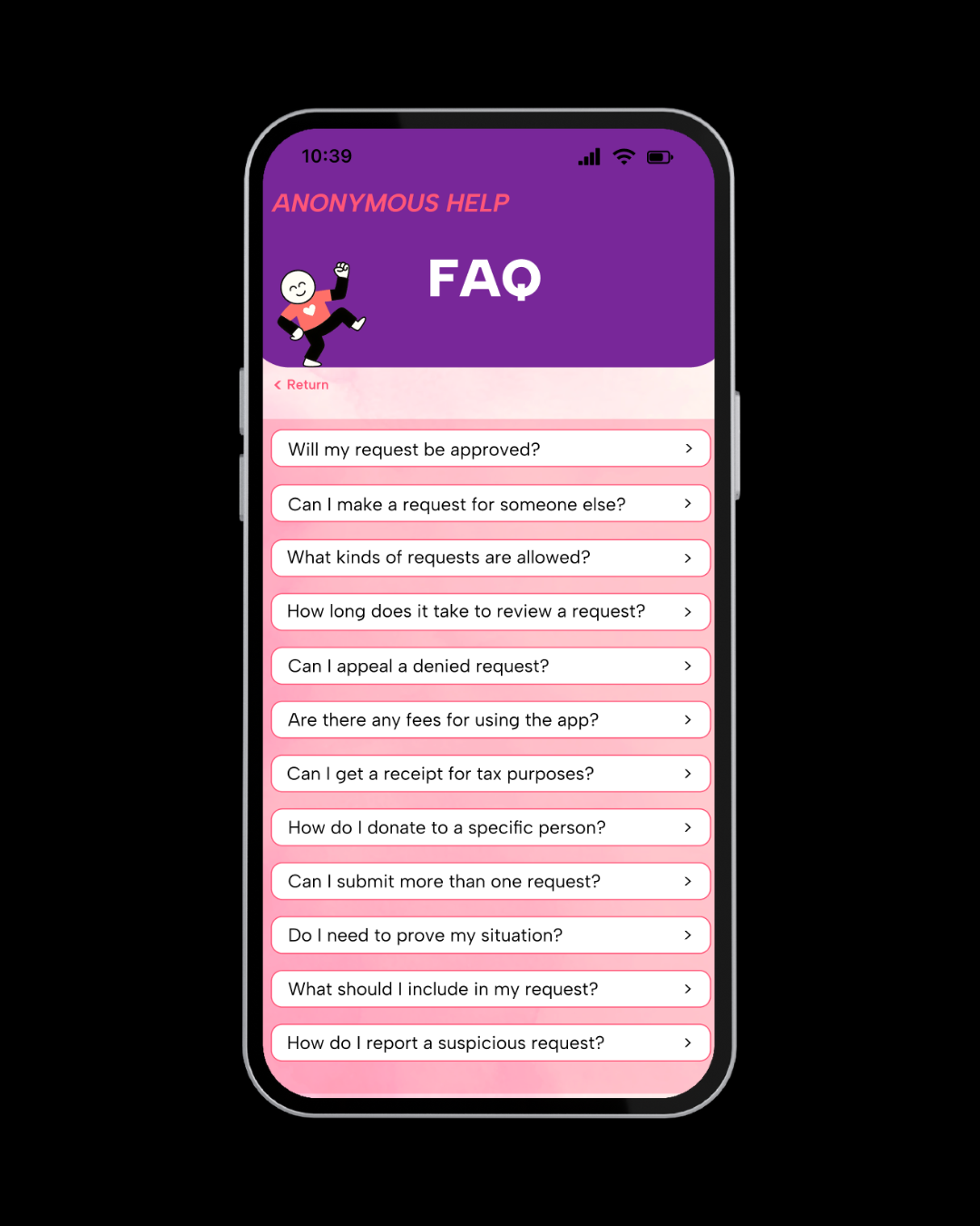
The result was a high-fidelity prototype of Anonymous Help, an app for compassionate, anonymous peer-to-peer aid. It centers dignity, speed, and privacy.
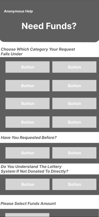
1. Quick Anonymous Requests
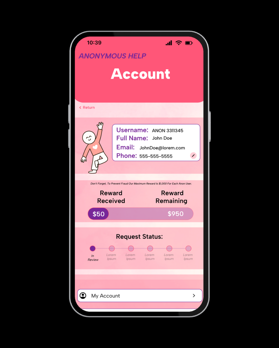
Users can ask for help in under a minute with just a short description and amount needed. Each request is tagged with a generic alias (e.g., Anonymous #1357) to lower the emotional barrier to asking.
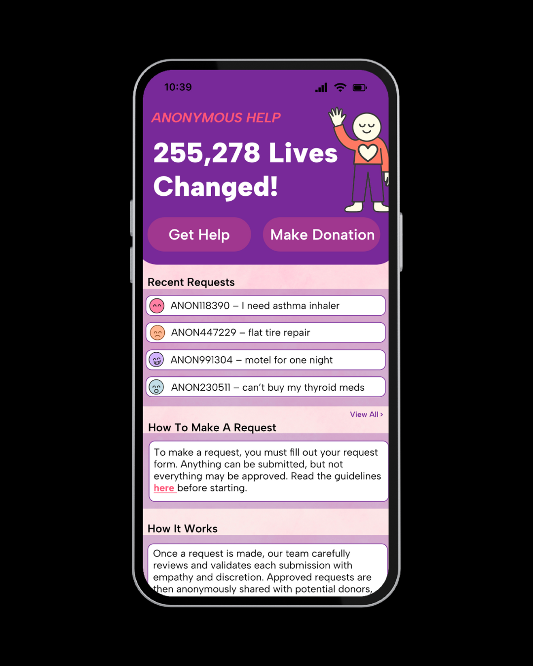
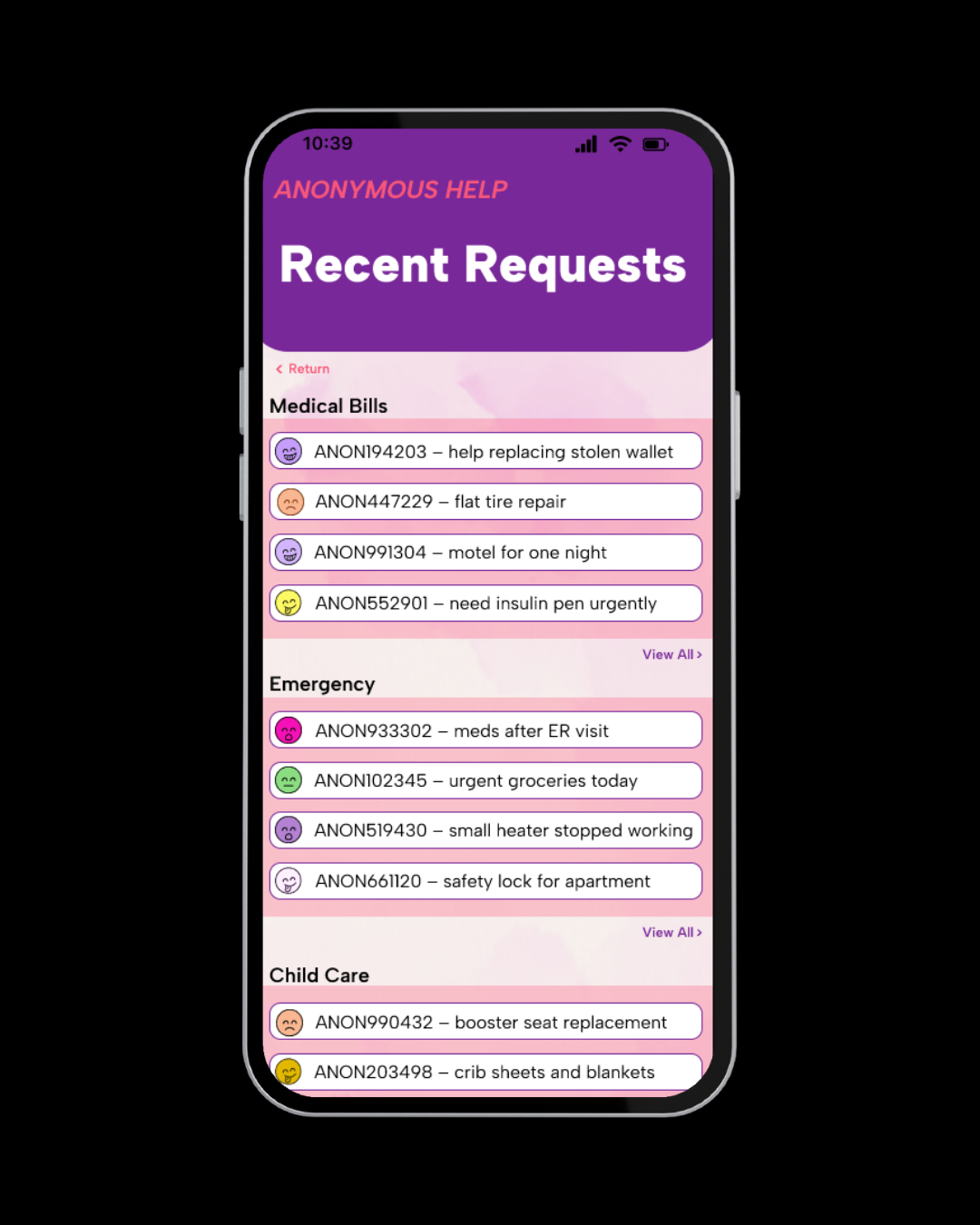
2. Community Feed
Requests are displayed in a scrollable feed sorted by urgency. Each card shows the need (e.g., “$90 to avoid electric shutoff”), its current funding status, and a brief context that’s enough for donors to connect, without violating privacy.
3. Secure One-Tap Donations
Donors choose a preset or custom amount and contribute instantly. Identities remain masked on both sides. A real-time progress bar and thank-you screen reinforce transparency and trust.
4. Privacy and Trust by Design
Built-in nudges discourage oversharing; moderation and “Community Supported” tags help surface trusted requests. A simple report tool adds accountability without requiring public exposure.
5. Autonomy After Help
Once funded, users can send anonymous “thank-you’s” if they choose to show their thankful.
Anonymous Help bridges a gap in existing platforms: it makes asking feel safe and small-scale giving feel personal.
It's not just about solving needs, it's about protecting dignity.