
SUNPASS REDESIGN
How might we reduce cognitive friction in a system people use every day?
SunPass is a daily-use tolling app for Florida drivers, but the existing interface creates unnecessary mental effort through duplicated navigation, overlapping pathways, and visually competing actions. Users hesitate, backtrack, and lose confidence during simple tasks like checking balances, paying tolls, and adding funds.
Case Study
Bentley University Individual Project
Timeline
Fall 2025
Role
UX Researcher & Designer
Tools Used
Figma, Canva
Current Status
This project examines and redesigns the SunPass mobile app through the lens of metacognition and decision-making. SunPass is used daily by a large population of Florida drivers, yet the existing app introduces unnecessary cognitive friction through overlapping navigation pathways, duplicated labels, and visually dominant elements that misalign with users’ mental models.
Through moderated think-aloud sessions with two users utilizing the current model of the SunPass app, I observed repeated backtracking, extended pauses, and declining confidence during core tasks such as locating account balances, paying tolls, and deciding whether to add funds. Users frequently questioned whether they were in the correct screen and relied on visually salient tiles rather than accurate navigation paths, indicating a breakdown in monitoring and control during decision-making. Post-task confidence dropped by roughly one-third, suggesting the interface actively undermines user certainty rather than supporting it.
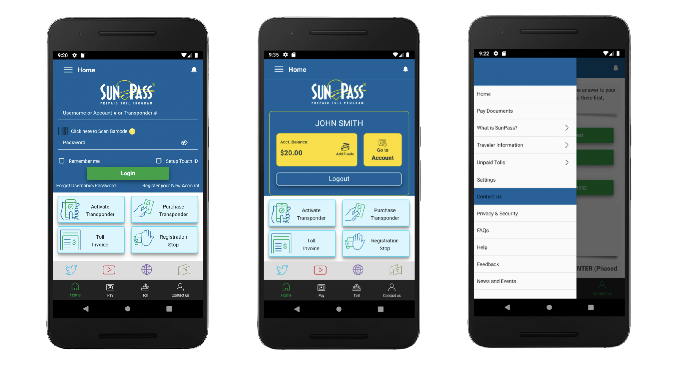
REDESIGN & RATIONALE
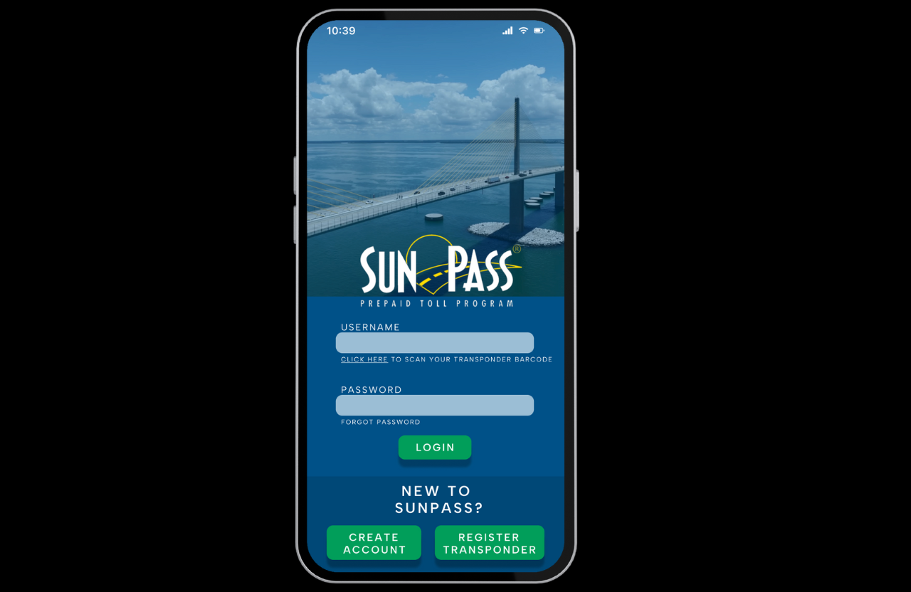
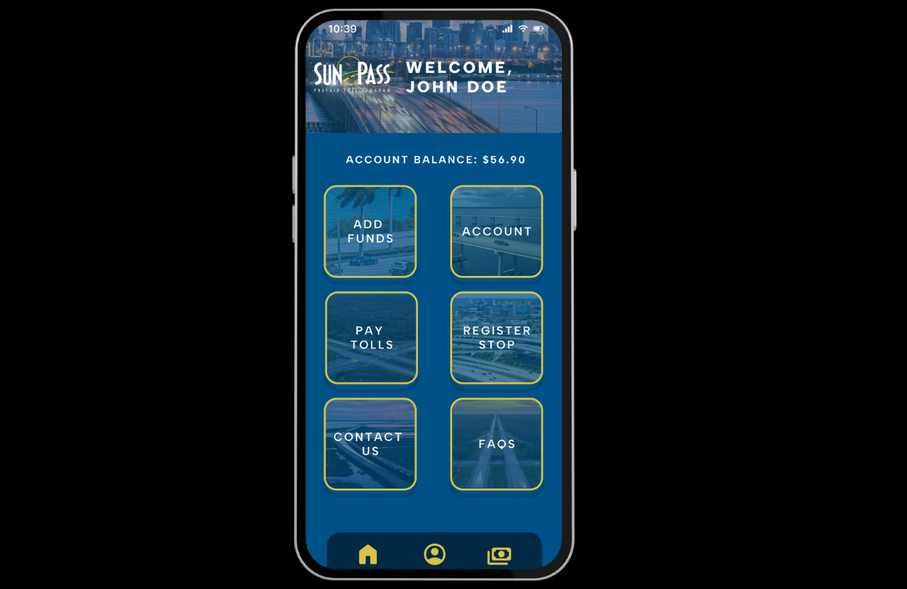
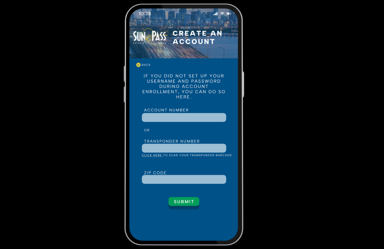
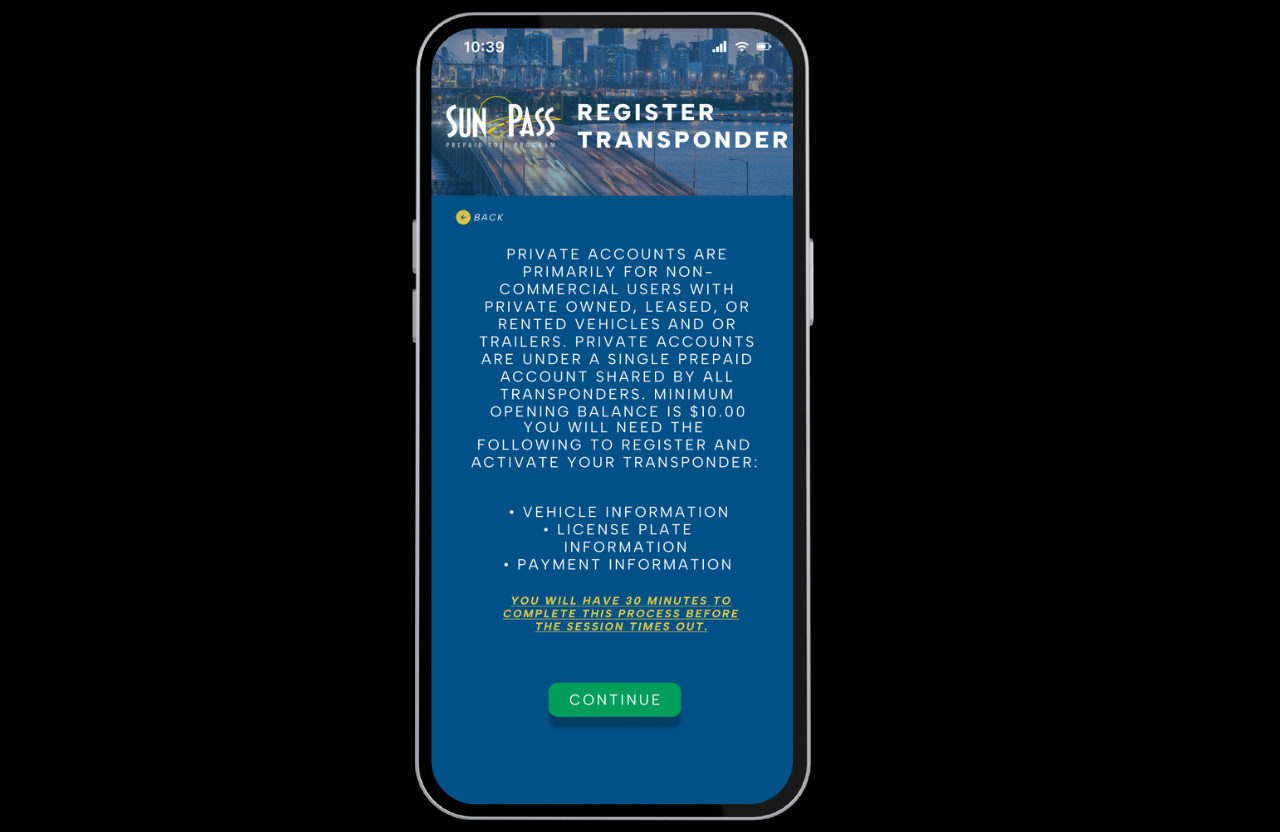
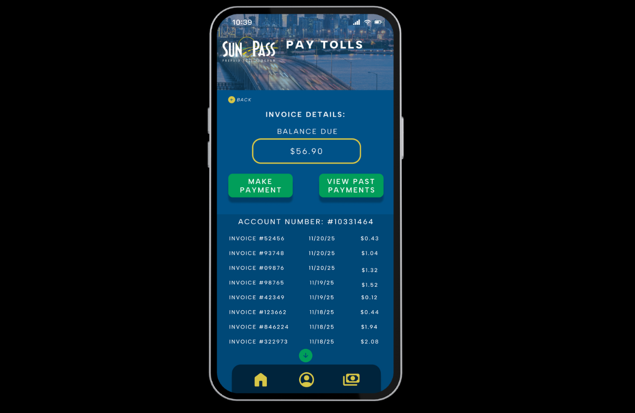
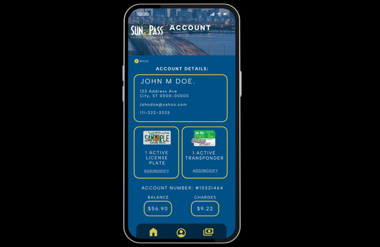
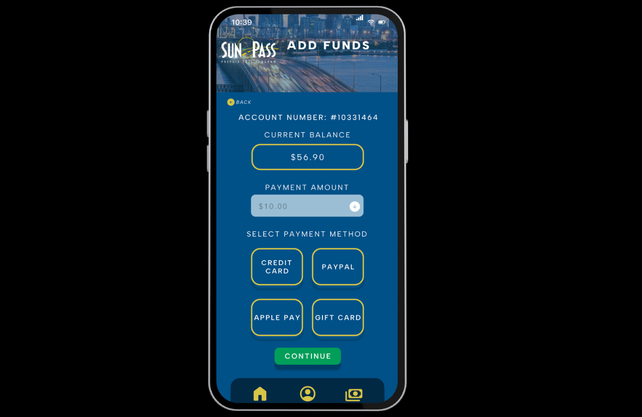
Rather than adding features, the redesign focuses on structure. Navigation is consolidated into a single, predictable system. Core actions such as Add Funds, Pay Tolls, Account, and Registration Stop are consistently placed and visually distinct. Screens are organized to surface critical information first, reducing search time and hesitation.
Information-dense workflows were restructured into linear, scannable layouts to better support time-pressured users, older adults, and neurodiverse users who may be more sensitive to option overload. Visually, the interface was simplified to reduce cognitive load and improve cue salience. Card hierarchy, spacing, and contrast were adjusted to ensure that primary actions are emphasized without competing with secondary information. Payment and transaction screens now surface critical details immediately, minimizing the risk of decision avoidance or default behaviors that can result from uncertainty.
The result is a calmer, more intuitive SunPass experience that prioritizes clarity, confidence, and efficiency. This redesign demonstrates how aligning visual hierarchy and navigation with users’ metacognitive processes can meaningfully improve decision-making in high-frequency, real-world systems.